
Streaks
Redesign
That was a project I had been waiting years to be prioritized enough for the developers to pick up.
I knew there was a lot to gain in terms of user retention. There’s nothing like a good pat on the back after you achieve your daily goal. The tricky part was not to overdo it. We had limited resources, and anything beyond a plug-and-play Lottie implementation would likely be deprioritized.
Old streaks celebration screen had almost none emotional impact.
I was set from the start to delight user with a new animation but also make it as easy to implement as possible. I had to take into consideration that we are using Lottie files and most of the userbase is using low to mid range Android devices so the files should be light enough to not make any performance issues even in edge case scenarios.
I’ve started from the lesson completion animation. I wanted to create a seamless transition between two.
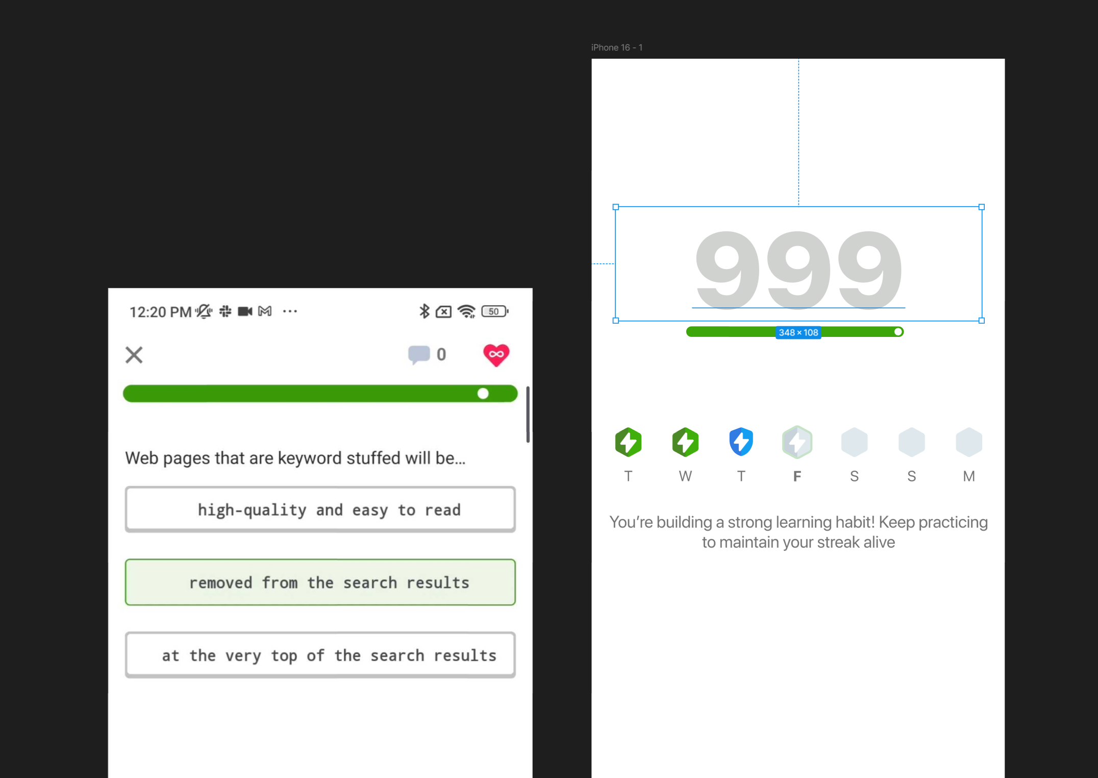
I’ve used the common graphical element of a lesson progressbar to tie together the visuals.

And I’ve prepared the hand-off documentation for the developers.